When my buddies over at Moo & Brew need some design work I’m always excited to jump in. Since I originally designed their logo mark for the Moo & Brew Craft Beer & Burger Festival way back in 2015 and then subsequently met my now wife at the event, the brand has always held a special place in my heart.

MOUSE OVER OR TOUCH FOR DEAILS
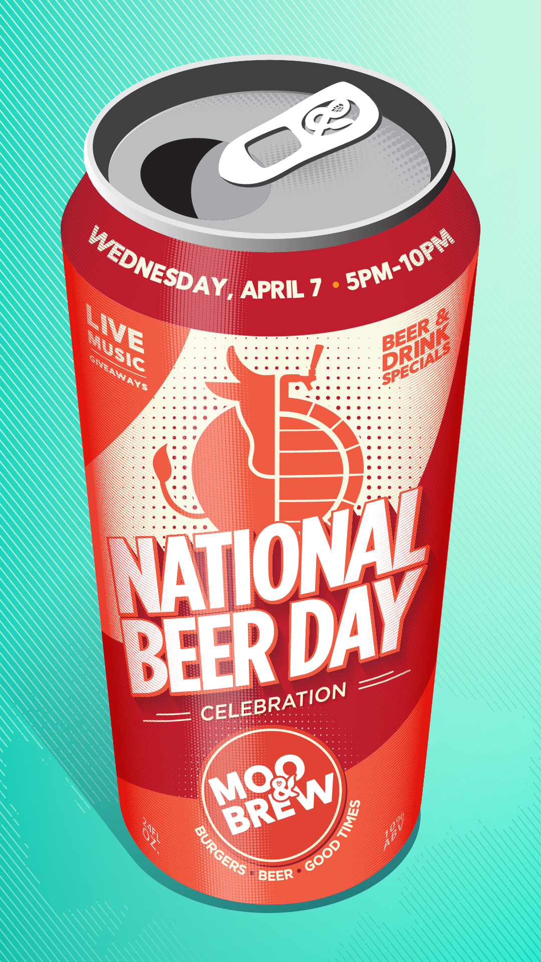
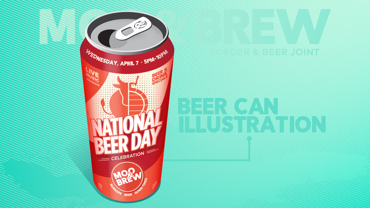
One of the owners recently asked me to design a graphic for their upcoming National Beer Day celebration and we started kicking around a few ideas. We talked about maybe using a pop art style we’ve used for one of the past festivals and he also had the idea to design a beer can with the event details on it. I liked where that direction could take us and immediately ran down the rabbit hole.
I wanted to do a completely vector illustration almost like I was designing for screen print with just a handful of colors and using dot shading for the gradients. I tried to keep a loose perspective with the curvature of the can and the viewing angle while still keeping everything legible.
It was a lot of fun getting lost in the details and I ultimately had to stop myself from tinkering with it for too long because this project had a short lead time.
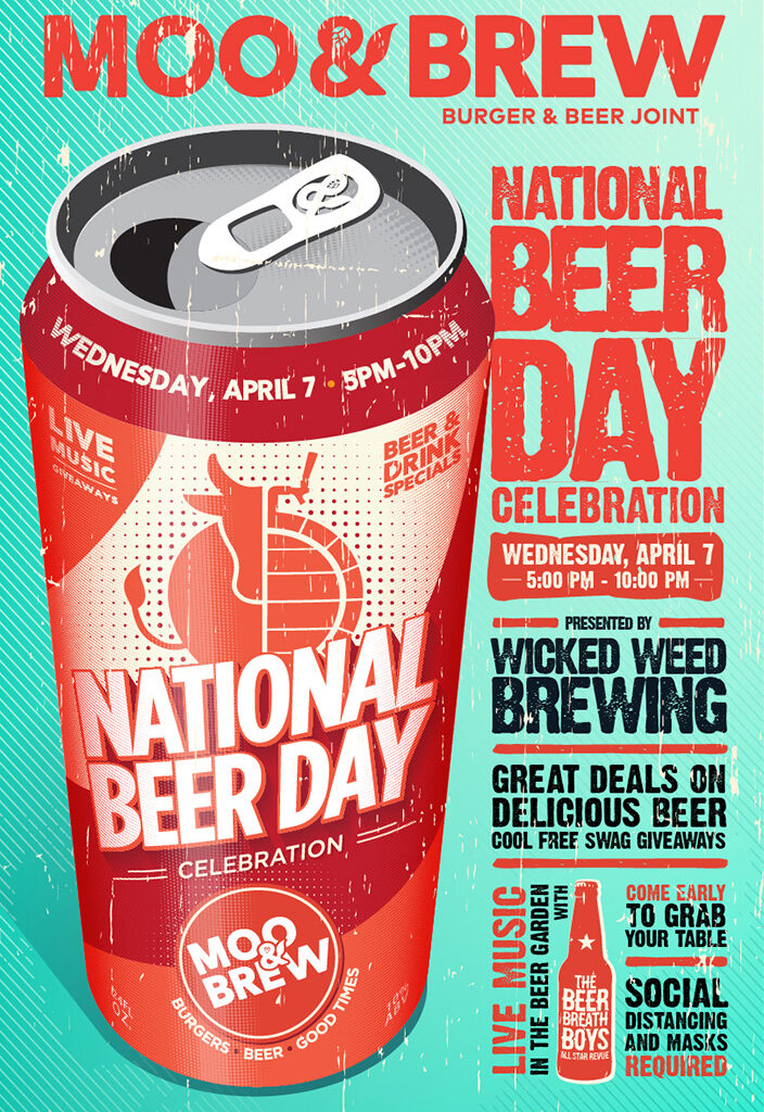
Per the customer’s request we added a grungy effect for the poster with extra details on the side for easy reading from a distance.
I was really happy with how this project turned out and it was a lot of fun to work on. Big thanks to the good folks at Moo & Brew for always throwing fun projects my way. If you are able to safely do so, stop in and show them some love or pick up an order to go!

